- Free Estimates
Interior paint trends for 2026 reflect a clear shift in homeowner priorities. Instead of stark minimalism or short-lived color fads, people are choosing tones that feel grounded, livable, and timeless. The focus is on comfort, depth, and colors that support how homes are actually used day to day.
Three categories dominate the conversation this year: warm neutrals, jewel tones, and nature-inspired greens. Each offers flexibility, longevity, and a strong visual impact when applied correctly. Understanding how and where to use these colors is key to getting results that look intentional rather than trendy.
✔ Warm neutrals are replacing cool grays for a softer, more livable look
✔ Jewel tones are best used strategically, not across entire rooms
✔ Nature-inspired greens remain the most versatile color family
✔ Paint finish and lighting affect color more than most homeowners expect
✔ Trend colors require proper prep and application to look consistent
Paint color isn’t just aesthetic—it influences mood, perceived space, and even how clean or cohesive a home feels. With many homeowners investing more into their interiors rather than frequent moves, paint choices are being made with longevity in mind.
The 2026 trends are less about statement walls for social media and more about creating spaces that feel calm, warm, and well-designed over time. That’s why these palettes are showing up consistently across design forecasts, paint manufacturer releases, and real-world residential projects.
Cool gray interiors dominated for nearly a decade, but homeowners are increasingly finding them flat and uninviting. In 2026, warm neutrals are firmly in control.
Warm neutrals include shades like:
These colors still function as neutrals, but they add depth and softness instead of feeling sterile.
Warm neutrals:
They’re especially popular in open-concept living areas, hallways, and whole-home repaint projects where cohesion matters.
Used correctly, warm neutrals create continuity without sacrificing character.
While neutrals dominate large areas, jewel tones are being used strategically to bring richness and personality into interiors.
Expect to see:
These colors aren’t loud when applied thoughtfully. Instead, they create contrast and elegance.
Jewel tones are most effective in:
They’re ideal for spaces where homeowners want a sense of intimacy or focus without committing to bold color throughout the entire home.
Balance is critical. Jewel tones pair best with:
When overused, they can feel heavy. When applied with intention, they elevate the space.
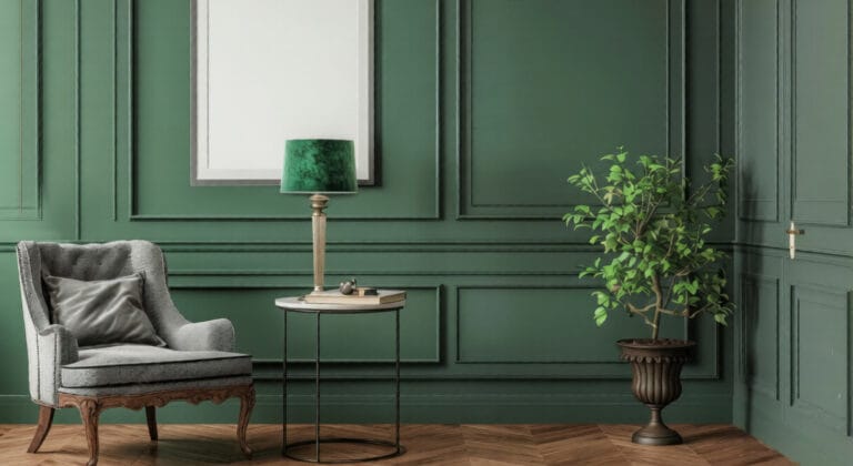
Green continues to dominate interior paint trends, but the direction has evolved. Bright or artificial greens are out, replaced by tones that feel rooted in nature.
Homeowners are gravitating toward:
These shades connect interiors to the outdoors without feeling rustic or dated.
Nature-inspired greens:
They’re also among the few colors that can function as either a neutral or a feature color, depending on saturation.
Green is particularly effective in homes that already incorporate natural textures or outdoor views.
Paint finish significantly impacts the long-term performance of the chosen shades.
Darker jewel tones often look best in matte or eggshell, while warm neutrals benefit from a subtle sheen that reflects light evenly.
One of the most overlooked factors in interior painting is lighting. Natural and artificial light dramatically affect how warm neutrals, greens, and jewel tones appear.
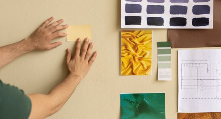
Testing paint samples in different lighting conditions before committing is essential, especially with trend-driven colors that rely on undertones.
Trend colors are less forgiving than basic whites or grays. Uneven coverage, visible brush marks, or improper prep can undermine even the best color choice.
Professional painters understand:
For homeowners in Glastonbury and surrounding areas, working with experienced local painters ensures that these modern color trends translate into clean, durable results—not patchy or inconsistent finishes.
Trends should guide decisions, not dictate them.
The strongest interiors in 2026 are those that blend modern color direction with practical, long-term thinking.
Warm neutrals provide a stable foundation. Jewel tones add depth where it counts. Nature-inspired greens bring balance and flexibility. Together, they offer homeowners a palette that feels current without being disposable.
By choosing colors that align with how your home functions—and ensuring they’re applied correctly—you get results that last well beyond the trend cycle.
Turn 2026 paint trends into a long-term upgrade with Glastonbury Professionals House Painters today

The most popular interior paint colors for 2026 include warm neutrals like beige and greige, deep jewel tones such as emerald and sapphire, and nature-inspired greens like sage and olive. These colors prioritize warmth, depth, and long-term appeal over short-term trends.
Yes, warm neutrals are increasingly preferred over cool grays because they create a more inviting atmosphere and adapt better to different lighting conditions. Warm neutrals also pair more naturally with wood floors, stone surfaces, and modern interior finishes.
Jewel tones work best when limited to accent walls, dining rooms, home offices, or built-in features. Pairing them with warm neutrals, lighter trim, and appropriate lighting prevents the space from feeling heavy or closed in.
Yes. Nature-inspired greens remain one of the most popular and flexible interior paint choices in 2026. Muted shades like sage, moss, and eucalyptus function well as both accent colors and full-room applications.
Eggshell and satin finishes are the most commonly recommended for trend-driven interiors. Matte finishes work well for darker jewel tones, while satin performs best in high-traffic areas like hallways and kitchens.